Rosty
This project is a comprehensive development of product extensions for coffee ordering, including a mobile application, user settings and a visual system.
The project was completed for the client as a concept and design solution, but was not put into production.
Outcome
Problem
The lack of a unified digital flow for ordering, payment (QR), and fulfillment (pickup/delivery) results in a slow, non-personalized, and non-transparent user experience, leading to lower conversion rates and reduced repeat purchases.
Goal
Reduce order completion time, increase conversion, and drive repeat purchases by introducing a personalized, mobile-first experience with fast ordering, QR-based payment, and transparent fulfillment (pickup/delivery).
Competitor analysis
Conducted a competitor analysis of leading food delivery and coffee apps (Starbucks, Yandex Go, Samokat, Delivery Club, Dodo Pizza) to benchmark ordering, personalization, and fulfillment flows.
Identified key strengths, weaknesses, and opportunities to design a faster, more intuitive, and personalized user experience.
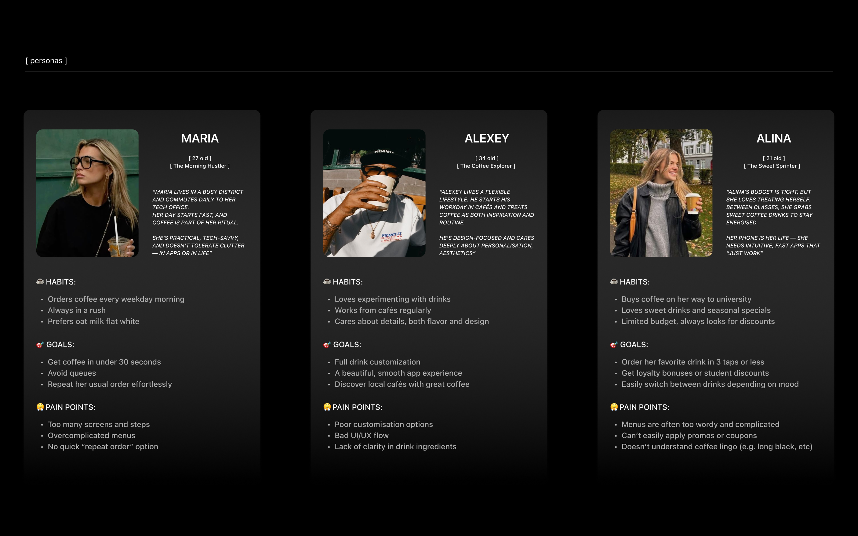
User Personas
Defined key user personas based on behavioral patterns and ordering contexts (on-the-go, delivery, repeat orders) to better understand user needs and pain points.
This allowed prioritizing features such as fast reordering, personalization, and transparent order tracking.
Customer Journey Map
To better understand the end-to-end user experience, I mapped the customer journey across the key stages of ordering coffee.
The goal was to identify friction points and uncover opportunities to simplify and optimize the flow.
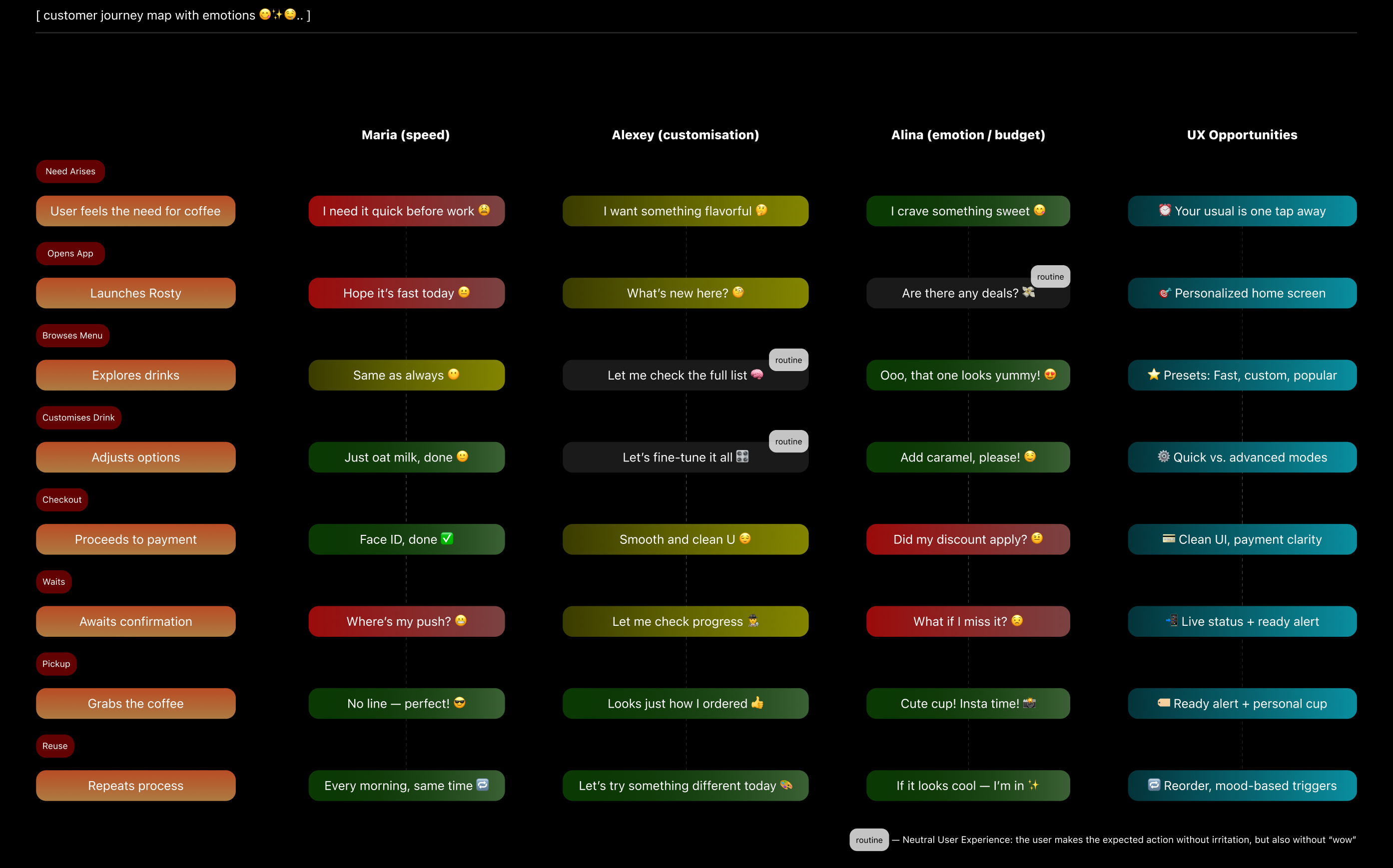
🔥 Key Insights
Users value speed, simplicity, and repeatability in ordering, but existing solutions either lack personalization or overload the interface.
There is an opportunity to create a fast, intuitive, and personalized experience with clear order tracking for both pickup and delivery.
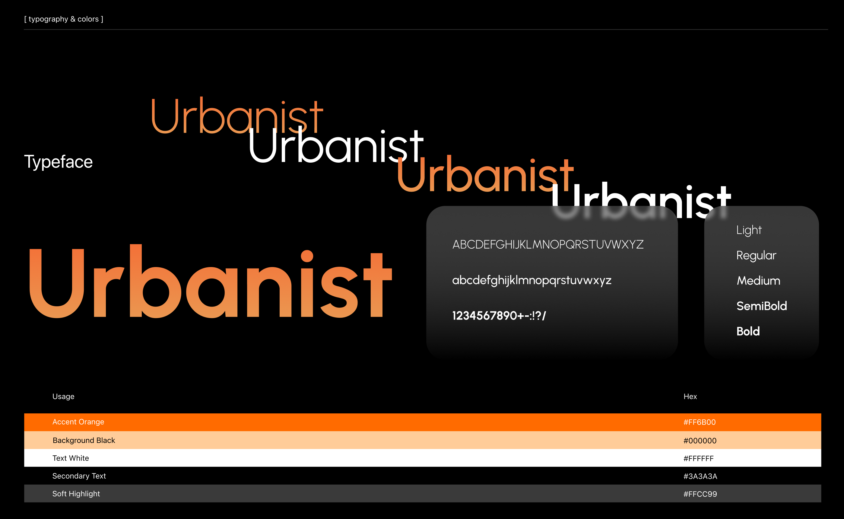
Typography & Color
After synthesizing insights from research and competitor analysis, I transitioned to defining the visual system, focusing on color and typography to support usability and decision-making. The visual system combines a warm, coffee-inspired color palette with clean, highly readable typography to guide user attention, highlight key actions.
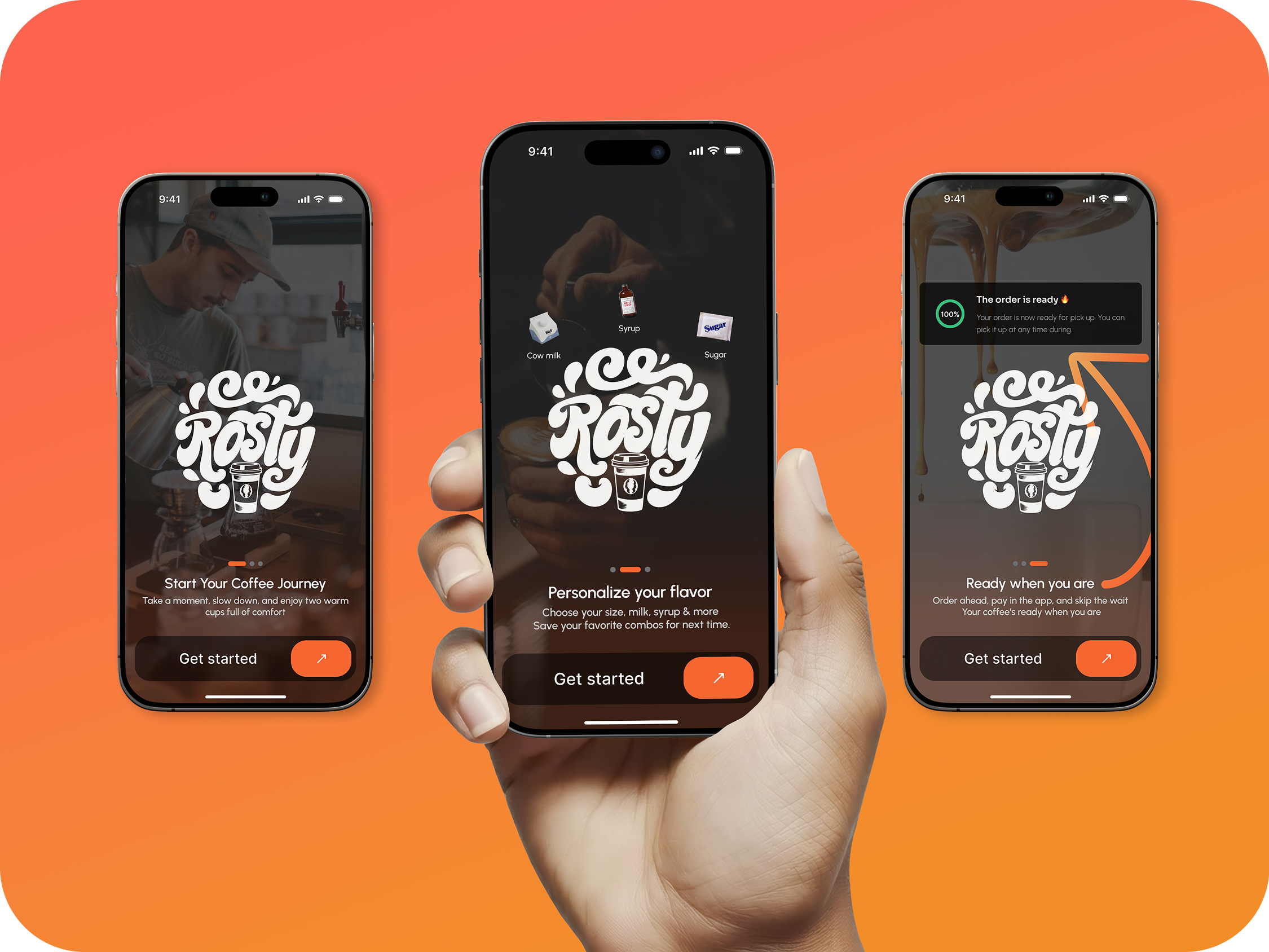
Onboarding
The onboarding flow was designed to minimize friction and get users to their first order as quickly as possible.
Minimal number of steps
Focus on immediate access to the product
No unnecessary information or distractions
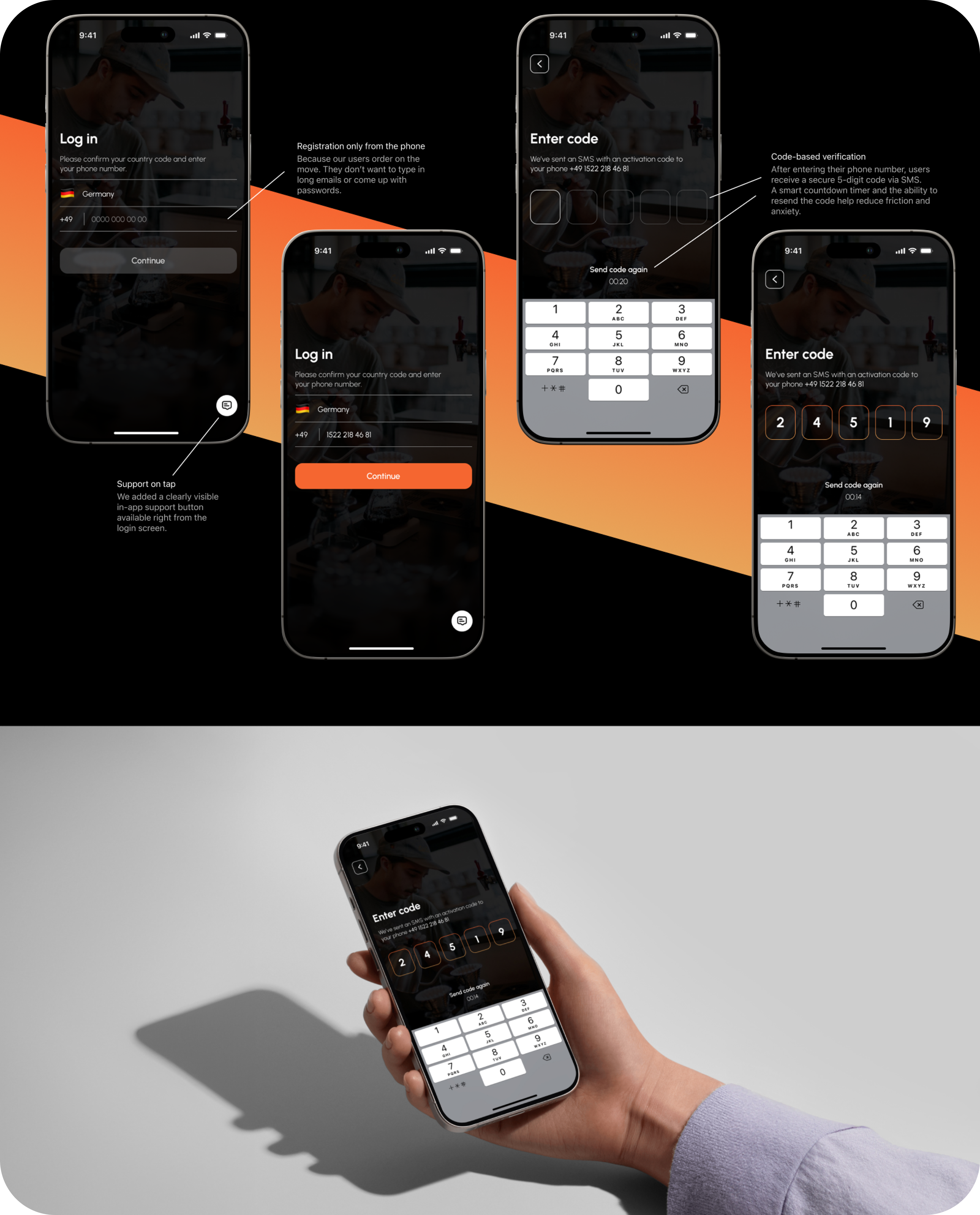
Sign up & Verification
The sign-up flow was designed to be fast and effortless, reducing barriers to entry.
Phone number-based authentication
One-time code verification (no passwords)
Minimal input required from the user
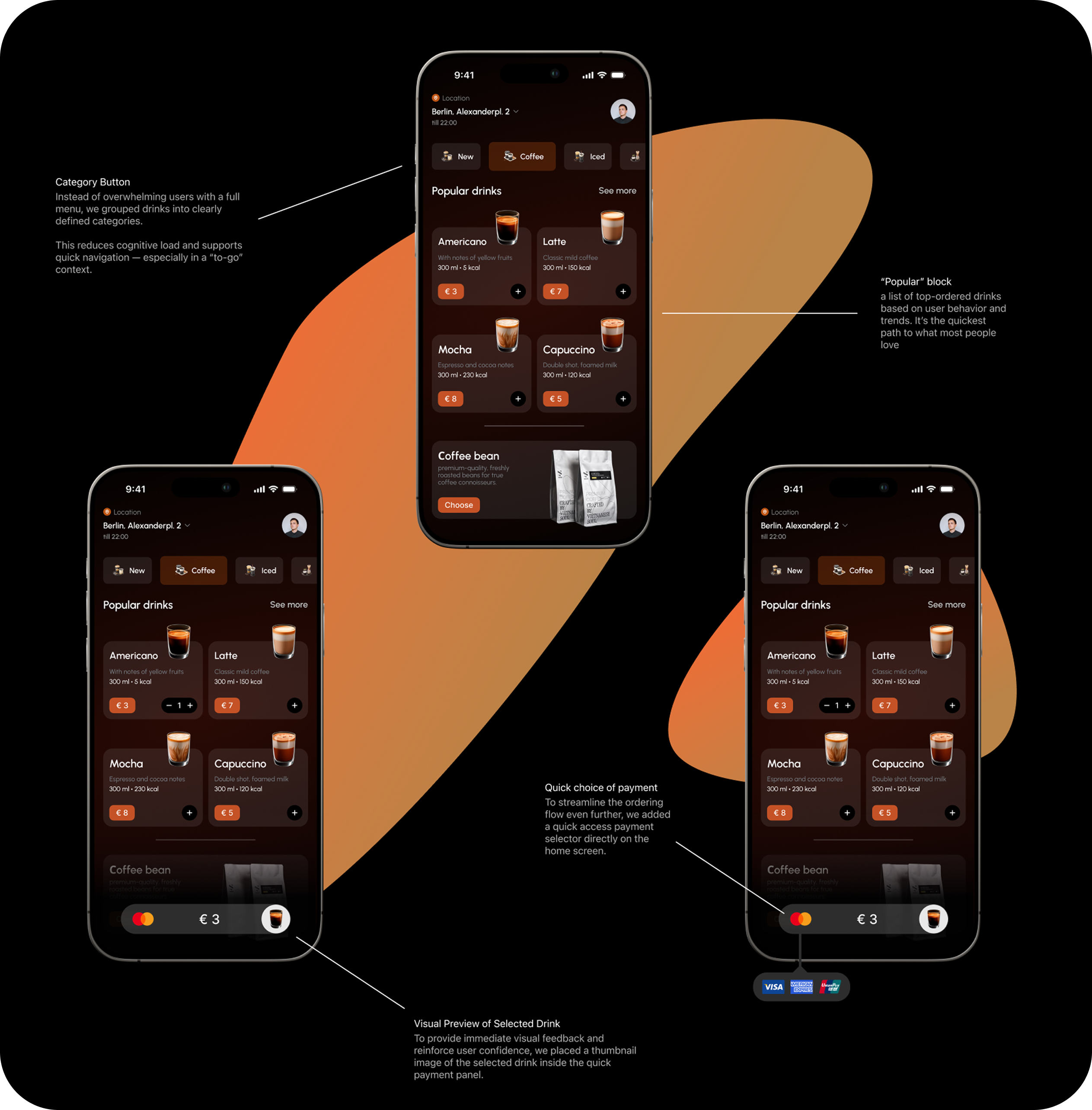
Home Screen
The home screen was designed as a central hub for quick actions, allowing users to complete their order with minimal effort.
Quick access to popular drinks
Reorder functionality for frequent users
Clear category structure
Personalized recommendations
The layout prioritizes speed and visibility, helping users make decisions quickly without navigating through multiple screens.
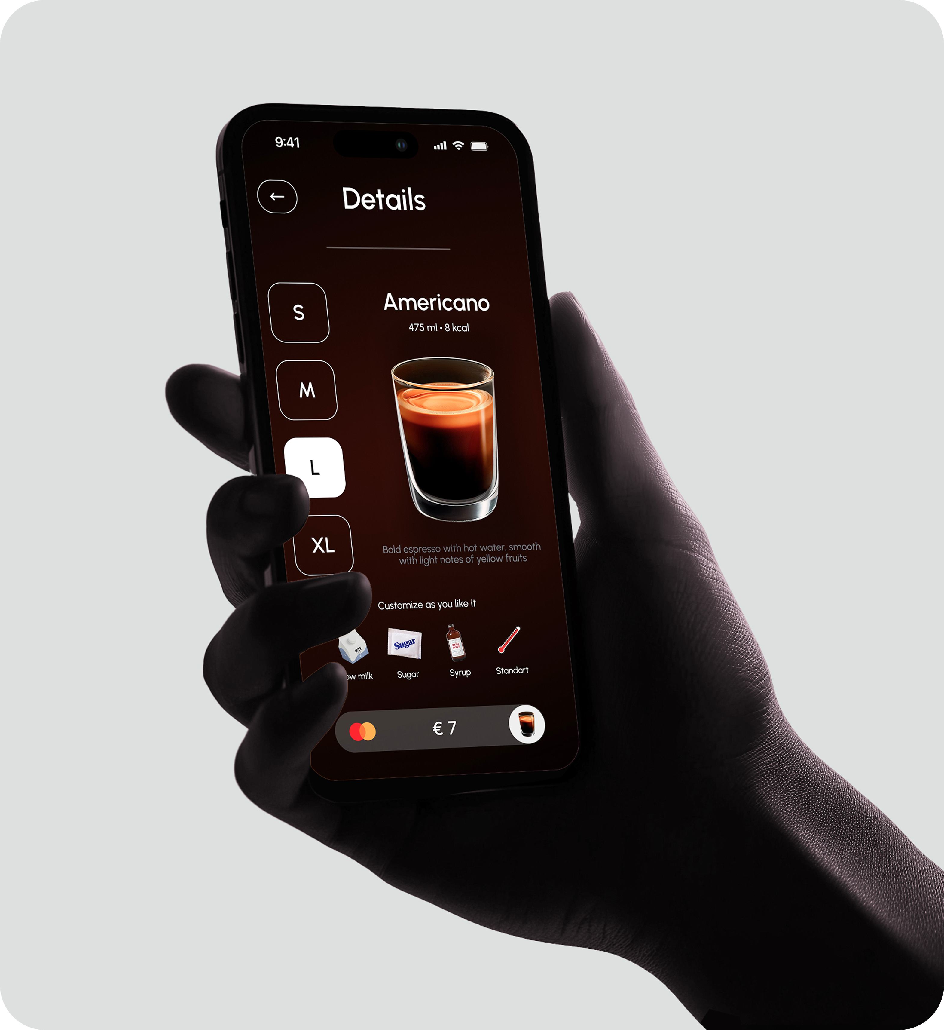
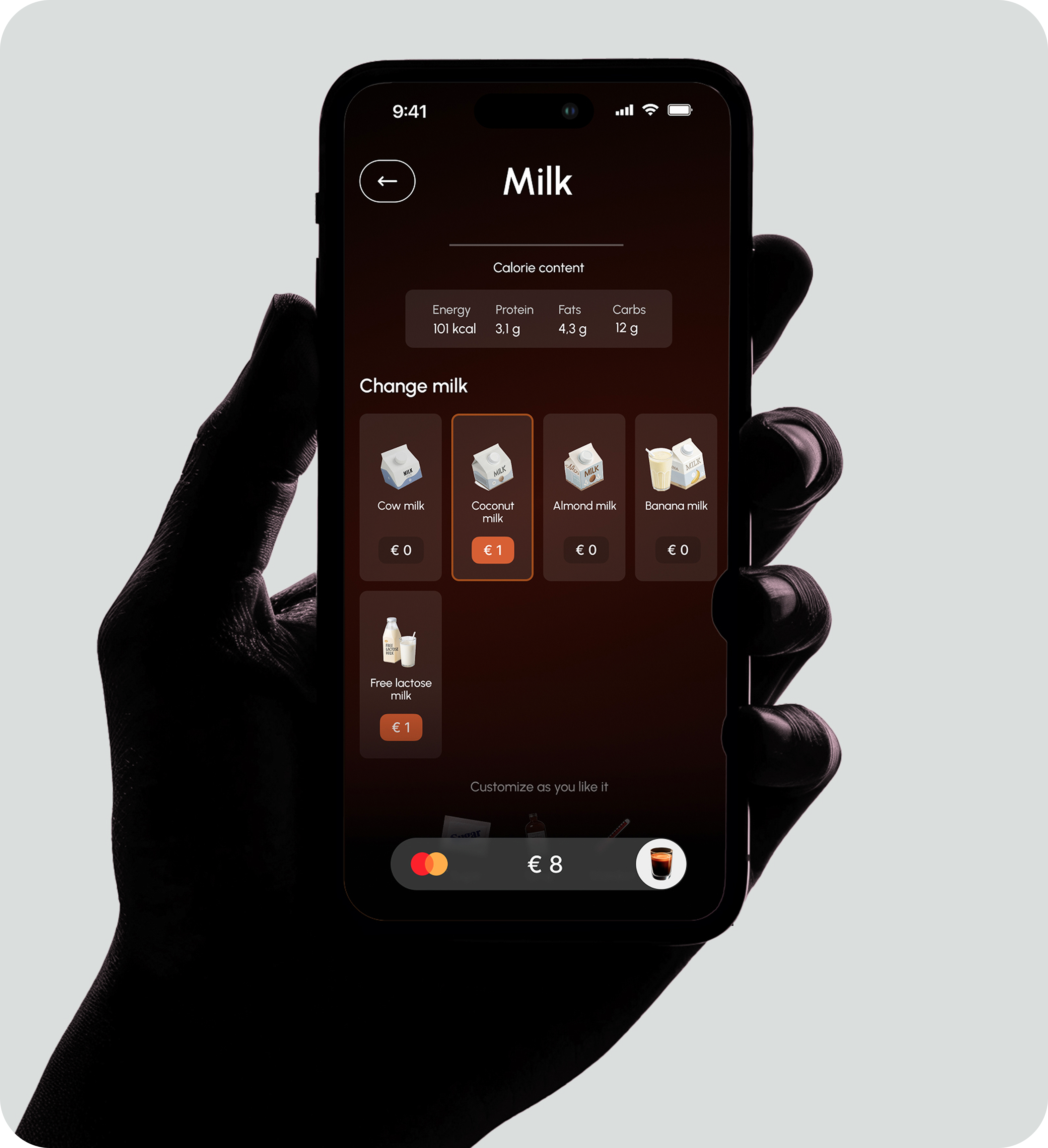
Personalisation
Personalisation was introduced to reduce repetitive actions and speed up the ordering process.
Saved orders enable quick repeat purchases
Recommendations highlight relevant drinks
Content adapts based on user behavior
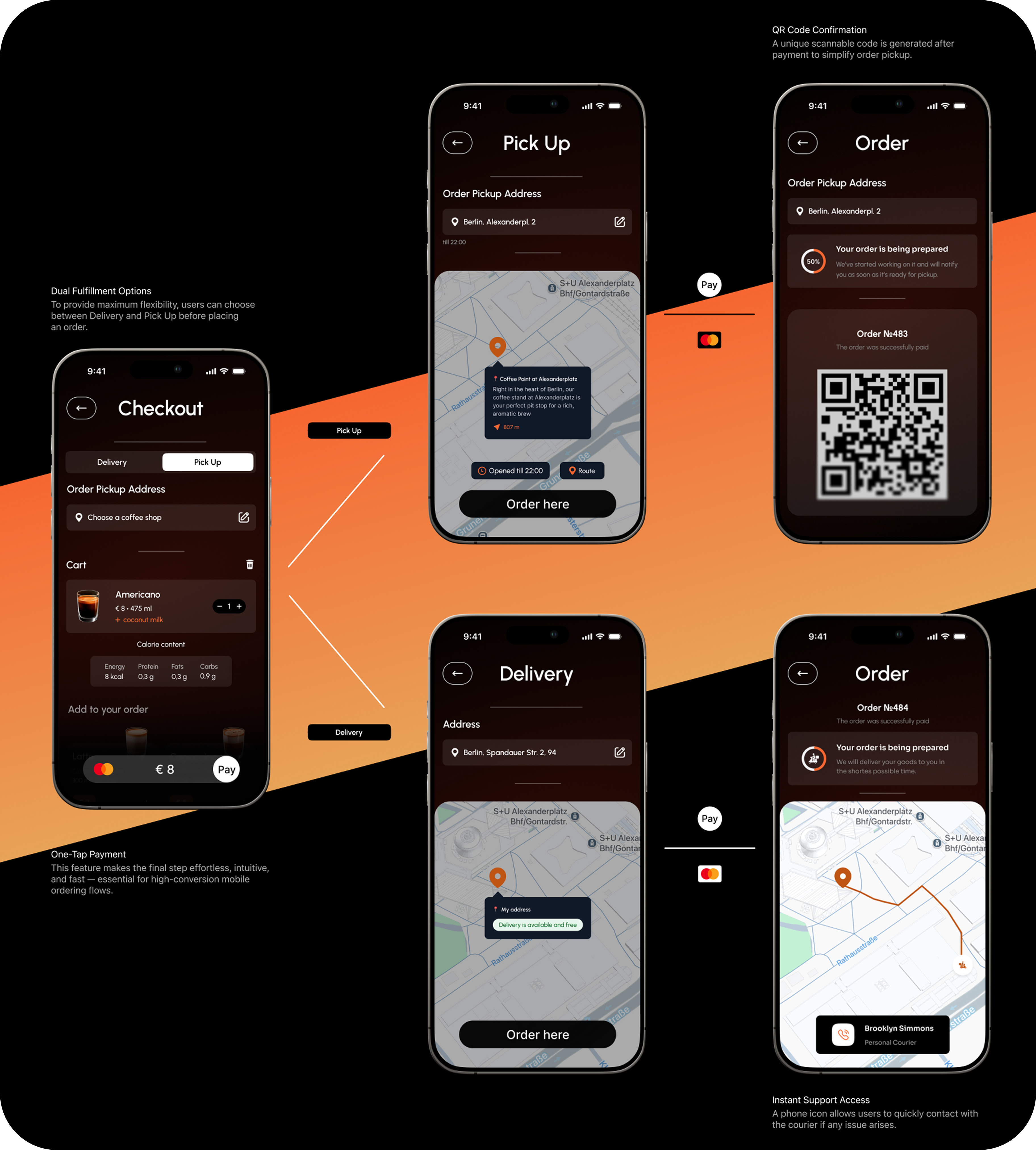
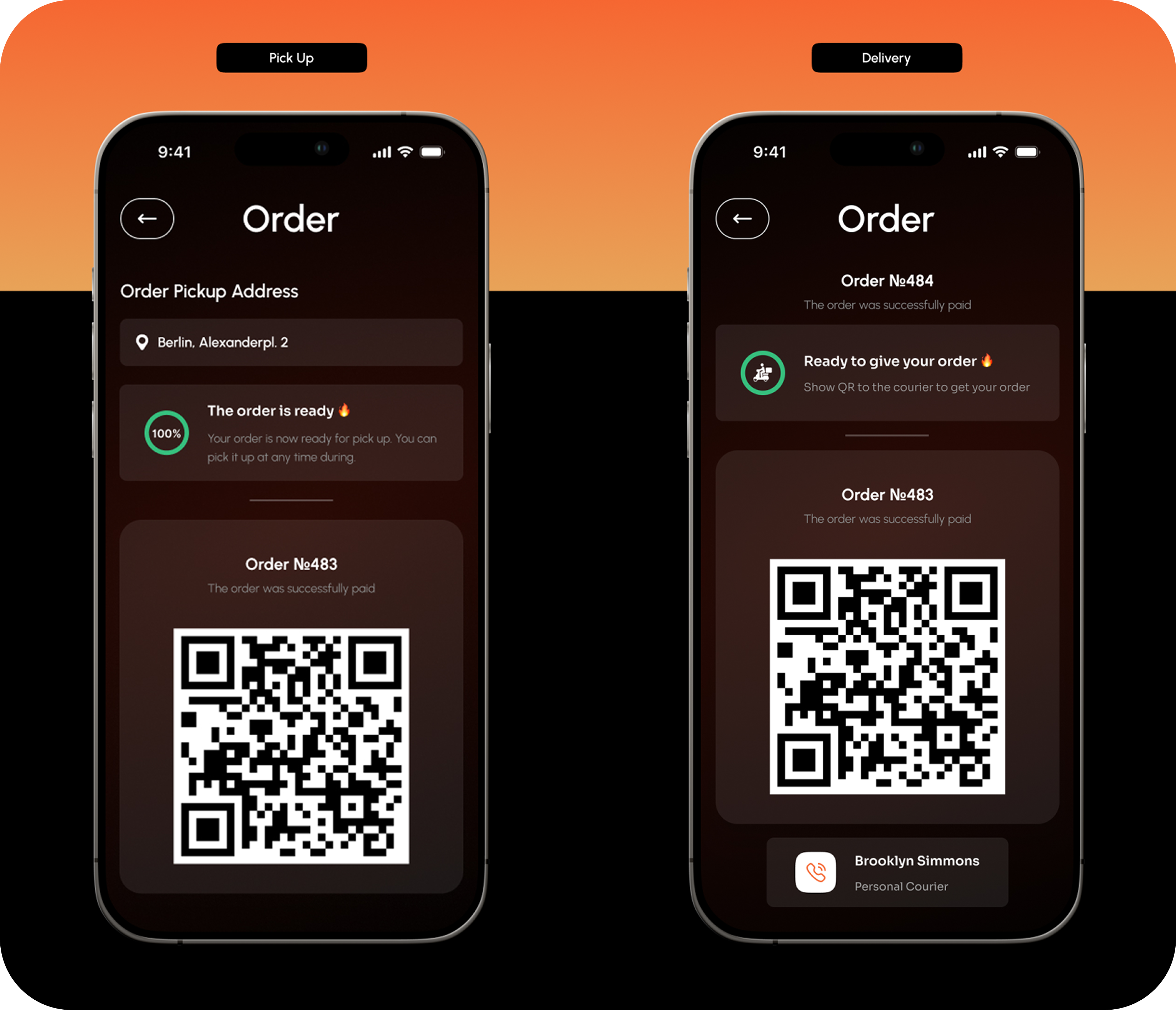
Checkout & Order Status
The checkout and order status flow was designed as a seamless end-to-end experience, from payment to pickup.
Minimal steps to complete the order
Clear and structured checkout process
Immediate confirmation after payment
Visual progress indicators for order status
Clear pickup instructions
The goal was to reduce friction during checkout and eliminate uncertainty during the waiting stage, ensuring a fast and predictable user experience.
Result
The project resulted in a fully designed end-to-end concept for a coffee ordering experience, covering the entire user journey from entry to pickup.
The final design demonstrates how prioritizing speed, repeat behavior, and clarity can shape a cohesive and efficient product experience, even at the concept stage.
Visuals